

Envato’s Email
Design System
DESIGN SYSTEM
Designing for designers.
Envato introduced me to the SaaS world, allowing me to work across a diverse range of digital channels. I am particularly proud of leading the CRM design direction and building their design system completely from scratch during Envato’s rebrand process.

THE CHALLENGE
No Existing Design Library: A centralised library for email design components didn’t exist, leading to inefficiencies.
Email Design Workflow: Emails were being designed from scratch in Figma for every new email send.
Builder Constraints: Iterable, the email builder, had specific constraints that weren’t reflected in Figma designs.
Inconsistencies: Padding, text sizes, and button sizes lacked design consistency.
Dark Mode: Future email designs needed to be optimised for dark mode.
Company Rebrand: Envato was undergoing a rebrand, requiring updates to colours, typography, and overall design guidelines.
THE SOLUTION
Create a Component Library: We developed reusable components for frequently used email modules to streamline design workflows.

THE BENEFITS
Centralised Source of Truth: A single source for components and styles ensures consistency and eliminates inconsistencies across designs.
Adaptable Components: Easy updates as guidelines evolve.
Streamlined Workflows: Designers focus on solving complex problems, not tweaking padding.
Speed & Efficiency: Pre-made components reduce the time spent replicating designs.
Minimised Waste: Reduces miscommunications and avoids unnecessary design or development revisions.

THE APPROACH
Audit:
Understand and audit frequently used email design modules (e.g. image columns showcasing downloadable items on Envato)
Develop Style Guidelines:
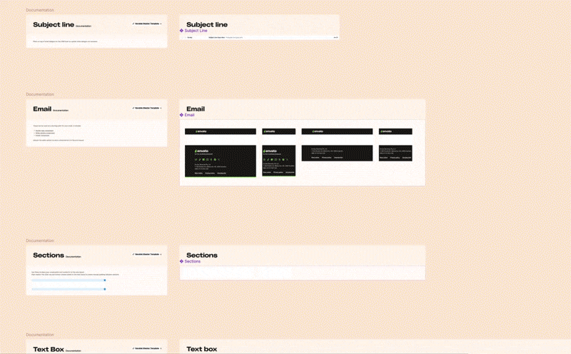
Documentation: Detailed notes documenting do’s and don’ts for email design and how to use the design library to design an email.
Branding: Defined colors, typography (desktop & mobile), and logo usage, ensuring alignment with the rebrand.
Spacing Guidelines: Standardized padding and margins for consistency.
Dark Mode: Considerations and adaptations for dark mode designs.
Border Radius: Guidelines for rounded corners across components.
Build a Component Library:
Component Naming: Clear, unique names for easy identification and correct usage.
Annotations: Notes and descriptions explaining each component’s purpose as well as rules and best practices for using each component.
Variables: Multiple color options, typographic sizes, and states for flexibility.
THE OUTCOME
Improved Efficiency: Email design time was significantly reduced by utilising pre-made components.
Consistent Branding: All email designs aligned with the company’s rebrand, maintaining a polished and professional appearance.
Enhanced Accessibility: Dark mode optimisation and standardised guidelines ensured inclusive designs for all users.
Scalable Design System: The component library provided a framework for ongoing updates and adaptability as brand or platform needs evolved.
Team Empowerment: Designers could focus on creativity and problem-solving, reducing time spent on repetitive tasks or resolving inconsistencies.
Positive Feedback: Stakeholders and collaborators praised the streamlined workflow and consistent visual output, reinforcing the success of the initiative.